The Business of Publishing
Readers really do judge books by their covers — in about a second, at thumbnail size. Here’s what separates a cover that sells from one that quietly says “homemade.”
“Don’t judge a book by its cover” is excellent moral advice and a terrible description of how book-buying actually works. Readers judge books by their covers constantly, instantly, and largely unconsciously, and they always have. A cover is the first thing a potential reader sees, often the only thing they see before deciding whether to look closer, and that snap judgment — made in roughly a second, frequently from a thumbnail-sized image on a screen — determines whether your book gets a chance at all. For self-publishing authors especially, who don’t have a publisher’s design department, understanding what makes a cover work is not an aesthetic luxury. It’s commercial survival.
The good news is that effective cover design isn’t mysterious or purely a matter of taste. It follows understandable principles, and the difference between a cover that sells and one that broadcasts “amateur” usually comes down to a handful of specific, learnable things — not whether the art is beautiful in isolation, but whether the cover does the particular jobs a cover has to do. Many writers approach their cover as a chance to express the book’s inner meaning or their personal vision, and that instinct, however natural, is exactly the wrong starting point. A cover is a marketing tool first and an artwork second, and confusing the two is the root of most amateur covers.
What a cover is actually for
A book cover has one primary commercial job, and it’s narrower than most writers assume: to instantly tell the right reader that this is a book for them. It is not there to depict a literal scene from the story, illustrate the deepest theme, or impress with intricate art. It’s there to communicate, in a fraction of a second and at a glance, what kind of book this is — its genre, its tone, its promise — to the specific readers who want that kind of book. A cover that makes a thriller fan think “thriller, my kind of thriller” in one second has succeeded, however simple it looks. A gorgeous, intricate cover that leaves readers unsure what they’re looking at has failed, however much skill went into it.
This is why so many author-designed covers miss: they optimize for the wrong thing. The author, who knows and loves the book, designs something rich with personal meaning — a symbol that matters to the plot, an image dense with significance — and produces a cover that communicates nothing to a stranger scrolling past. The reader doesn’t know the book; they know only the cover, and the cover has one second to say “this is the kind of story you’re looking for.” Designing for the reader who doesn’t yet know your book, rather than for yourself who knows it intimately, is the single most important mental shift in cover design.
Genre conventions are a language, not a cliché
Browse the bestsellers in any genre and you’ll notice the covers share a striking family resemblance — the moody, textured darkness of thrillers, the specific typography and color worlds of romance, the particular look of literary fiction or epic fantasy or cozy mystery. Inexperienced authors often see this and recoil, determined to stand out by ignoring the conventions entirely. This is a costly mistake, because those conventions aren’t tired clichés; they’re a visual language that tells readers, instantly and reliably, what kind of book they’re looking at. A romance reader recognizes a romance cover in an instant, and that recognition is what makes them stop and look.
Defying genre conventions doesn’t make your book look refreshingly original to its intended readers; it makes it look like it belongs to a different genre, or to none, and the readers who’d love it scroll right past because the cover didn’t signal “this is for you.” The professional move is to honor the conventions of your genre — to clearly signal the category — while finding a distinctive execution within them. You want to look like you belong on the shelf with the books your readers already buy, and then be the most appealing option on that shelf. Fit in to be found; stand out to be chosen. Ignoring the language altogether just makes you illegible to the very people you’re trying to reach.
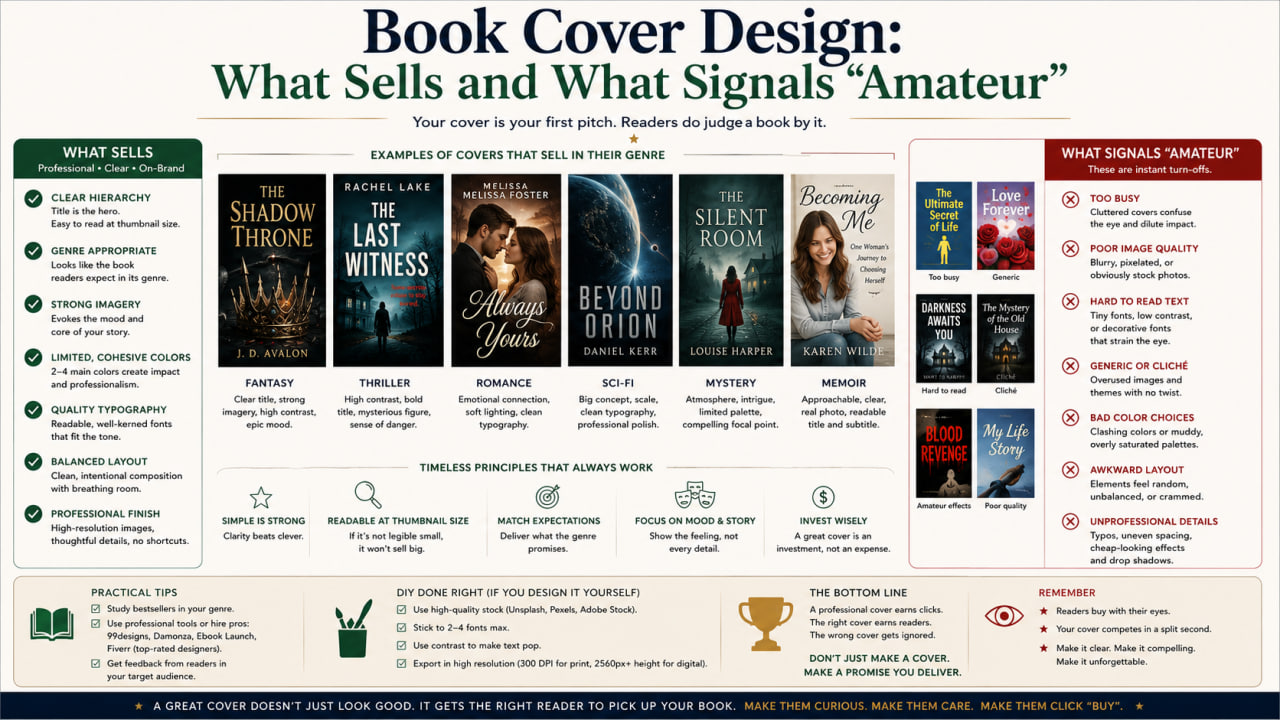
Tells that whisper “amateur”
Title or author name that’s hard to read, especially shrunk to thumbnail size.
Default or clashing fonts, or too many different fonts fighting each other.
Obvious, generic stock photos used flatly, with no design treatment.
A cover that doesn’t signal its genre — readers can’t tell what kind of book it is.
Crowded composition, weak contrast, or text laid awkwardly over a busy image.
Pass the thumbnail test
Here is a truth that should govern every cover decision: most potential readers will first encounter your cover as a tiny image. On a retailer’s website or a phone screen, your cover competes as a thumbnail barely larger than a postage stamp, long before anyone sees it at full size. A design that looks stunning at full resolution but turns into an unreadable, muddy smudge when shrunk has failed at the one size that matters most for sales. The thumbnail is where the buying decision begins, and a cover that doesn’t work there doesn’t get the chance to work anywhere else.
So test every cover by shrinking it to thumbnail size and asking the hard questions. Can you still read the title? Is it instantly clear what genre this is? Does it stand out, or vanish, among the other thumbnails it’ll appear beside? This test ruthlessly exposes the most common amateur failures — tiny unreadable text, low contrast, fussy detail that dissolves into noise — and it should be applied early and often. Professionals design for the thumbnail from the start, prioritizing bold, legible, high-contrast simplicity precisely because they know that’s the battlefield. Beautiful-at-full-size, useless-at-thumbnail is one of the most common and costly mistakes self-publishers make.
Typography exposes amateurs fastest
If there’s one element that separates professional covers from homemade ones, it’s typography — the choice and treatment of the type for the title and author name. Type is where untrained eyes go wrong most visibly: default system fonts that scream “made in a word processor,” a jumble of mismatched typefaces, lettering that’s too small or too thin or poorly spaced, text crammed awkwardly into corners or floated weakly over a busy image. Readers can’t always articulate why a cover looks amateur, but bad typography is very often the reason, registering as a vague but decisive impression of cheapness.
Good cover typography is a real craft: choosing typefaces that suit the genre and tone, sizing and spacing them for impact and legibility, and integrating them with the imagery so the whole composition feels intentional rather than assembled. This is genuinely hard to do well without training, which is a large part of why professional designers earn their fees. If you’re designing your own cover, treat typography as the place to be most disciplined and most willing to seek help — restrained, legible, genre-appropriate type will carry a simple cover far, while clever imagery undermined by clumsy lettering fools no one. The type is the first thing a trained eye reads as a quality signal, and the first thing an untrained author tends to get wrong.
Imagery, stock photos, and the uncanny
Imagery makes or breaks the rest of the cover, and it’s another place author-designed covers stumble. The problem usually isn’t using stock photography — professionals use it constantly — but using it flatly: dropping a recognizable, untreated stock image onto the cover so that it looks exactly like what it is, a generic photo anyone can license. The same image appearing on a dozen other books, or obviously sourced from a familiar stock library, undercuts the sense that the book is a real, considered product. Stock imagery works when it’s selected with taste and then transformed — color-graded, composited, treated — into something that feels made for this book.
There are also specific image traps to avoid. Figures whose faces are too prominent or oddly generic can feel uncanny and limit the reader’s imagination; clashing or low-resolution images read as cheap instantly; and a literal depiction of a plot scene is almost always weaker than an evocative, atmospheric image that conveys mood and genre. The cover doesn’t need to show what happens in the book; it needs to convey how the book feels and who it’s for. Restraint and atmosphere nearly always beat literalism and clutter. When in doubt, simpler, bolder, and more evocative outperforms detailed and explanatory — the cover suggests, it doesn’t narrate.
DIY or hire a designer?
Given how much rides on the cover and how specialized the skills are, the honest advice for most self-publishing authors is to hire a professional cover designer if you possibly can. A skilled designer who knows your genre’s market will produce something that signals category correctly, works at thumbnail size, handles typography expertly, and looks like a real book — and the cost, while real, is frequently the highest-return investment a self-publisher makes, because the cover so directly affects whether anyone buys at all. A weak cover can sink an excellent book; a strong one gives it a fighting chance. Few other expenses pay back so directly.
Designing your own can work, but only under specific conditions: you have genuine design skill, you’re willing to study your genre’s covers closely and learn the conventions, and you’ll apply the thumbnail test and typographic discipline honestly to your own work — which is hard, because authors are emotionally attached to their books and poor judges of their own covers. If you do go it alone, get candid outside feedback from people who’ll tell you the truth, study what’s selling in your category until the patterns are obvious, and resist the urge to express your personal vision at the expense of clear market signaling. The cover isn’t where you make your artistic statement; the book is. The cover’s job is to get the right reader to open it. And if hiring a designer is genuinely beyond your budget, the next best move is to study the strongest covers in your genre relentlessly and imitate their principles — the legibility, the restraint, the genre signaling — rather than inventing something untethered from what is proven to work. Borrowed discipline beats original misjudgment nearly every time, and a simple cover built on sound principles will always outsell an ambitious one built on none.
Common questions
Do covers really affect sales that much?
Yes — the cover is often the first and only thing a reader sees before deciding whether to look closer, and that decision happens in about a second. For self-published books especially, a professional-looking cover is one of the strongest factors in whether a good book finds readers, and it is routinely the difference between a title that sells steadily and one that disappears unseen.
Isn’t following genre conventions just being unoriginal?
No. Conventions are a visual language that tells readers what kind of book this is. Honor them so the right readers recognize your book, then be distinctive within them. Ignoring conventions doesn’t read as original — it reads as belonging to the wrong genre, or none.
Should I design my own cover to save money?
Usually not, unless you have real design skill and will study your market honestly. A professional cover is frequently the highest-return investment a self-publisher makes, because it so directly affects whether anyone buys. A weak cover can quietly sink an excellent book.
General educational guidance on book marketing and design. Costs and design tools vary and change over time. For author and publishing resources, see Poets & Writers and the Authors Guild.